

Meta Inbox Automations
Illustration system
The Inbox Core Experience team was restructuring the information architecture of the automation page in Inbox and needed a more scalable approach to illustrations that would support additional automation cases and features in the upcoming half. I created an illustration system that would more engagingly communicate the purpose of each automation and increase adoption of these valuable tools.

Success criteria
We were challenged to consider a variety of conditions:
Scalable
The system should be evergreen and support the additions of future use cases.Visual communication
The system should help businesses easily find the automations that fit their use case, as well as help identify the cases they have set up in the past.Building trust
The system should feel easy to use and visually set expectations for what functionality each automation case will deliver.
Visually, the concepts should stand in isolation yet feel cohesive as a group. The set of illustrations should also feel encouraging and engaging rather than robotic or too technical so that users do not feel overwhelmed.
Mindmap
To start this process, the BBS team mind-mapped the words we associate with MBS Inbox, the different automation categories, and the individual automations themselves. In the later weeks, as I dove deeper into the process, this FigJam served as a reference point, and ultimately, I did in fact use many of the words we had brainstormed, such as “letter” for “Instant Reply."


Moodboards
I find that visual moodboards serve a similar purpose to the verbal brainstorm I mentioned above: to spark inspiration and serve as a North Star throughout the project. Since this particular project was complex, I found it helpful to separate out moodboards into different categories, such as “aesthetic” or “competitor examples."

Concepts
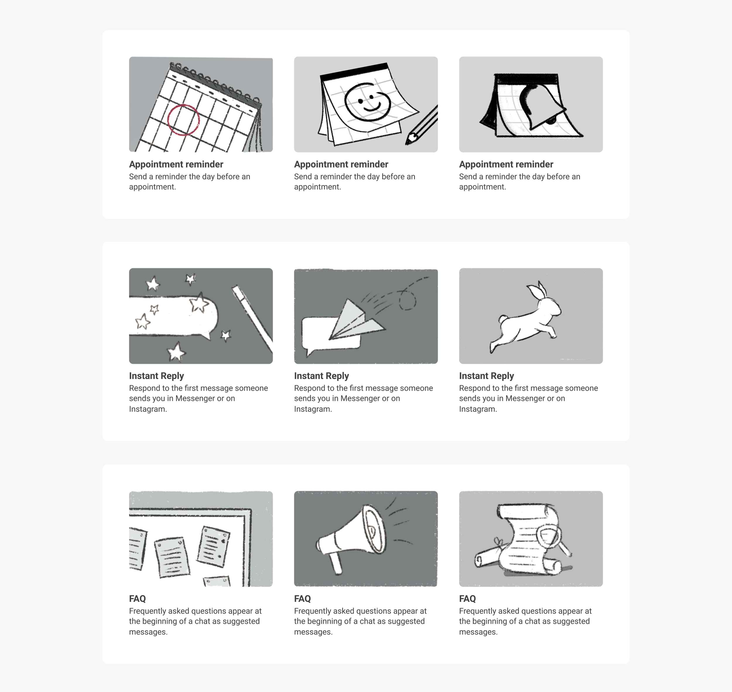
The final three sketch concepts for round one were: “message bubbles,” “utilitarian,” “humanistic-simple,” and “humanistic-complex.” Message bubbles felt redundant in the Inbox space, and "humanistic-complex" felt overly complicated. For the sake of visual simplicity, we ultimately we moved forward with “utilitarian,” keeping in mind that we would want our color palette to be warm and friendly to address our initial concern that businesses found automations overwhelming.


Sketches
The BBS team agreed that the sketches should feel as straightforward and rooted in the mobile icons wherever possible. I sketched three possible directions for each automation use case to present a variety of concepts to our stakeholders. The criteria to determine which sketch moved forward was based on clarity of concept, with the mobile icon as a secondary consideration.
Refinement
Our product stakeholders had emphasized that the system should feel friendly and approachable, yet professional and cohesive. Color would heavily influence how the user felt emotionally, so I kept the product designers’ guiding words in mind when choosing the foundational palette. I started with a primary color palette but immediately realized that too many warm colors felt loud and therefore did not achieve the professional look I was hoping for. At the same time, an all-cool color palette felt cold and unapproachable. The most successful color grouping seemed to be one that included a friendly yellow with a complementary color of purple combined with a calming teal blue.

Final Palette
I wanted to make sure that the illustration system felt inviting and inspired trust; I decided to include one additional color to push the palette closer to that emotional feeling. I knew that I needed an accent of red for specific, communicative moments—for example, a message with a red dot represents an “unread message.” In the process of experimenting with how much red should be included, I found that adding pink to the core group of yellow, purple, and teal helped to strike the right balance.

Guidelines
We had determined at the outset that we would need to create a guide that outlined these rules for BBS, the Inbox Core Experience team, other visual creatives at Meta, or contracted freelance illustrators. Throughout the process, I took note of what I would need to be able to explain, such as color rules, level of detail, and compositional guidance, so that anyone could refer to the guidelines and create new automation illustrations with ease.

