
Ads App Icons
July 2025 - November 2025
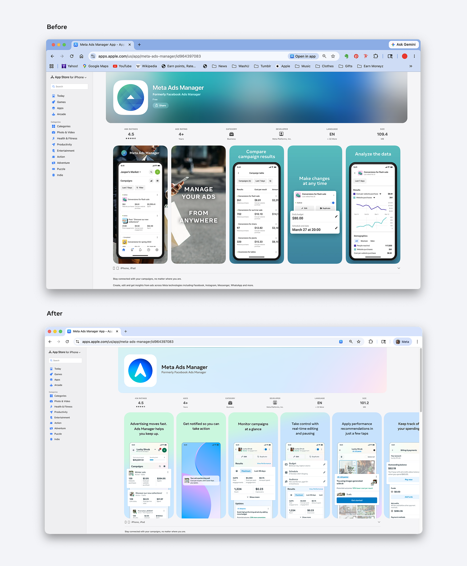
After a Creative Director’s departure, I took over the app icon visual refresh of Meta Business Suite and Ads Manager.
This project had been in alignment purgatory for two years. By the time I took over the project, the concepts had been narrowed down to 3 per app icon. I successfully gained alignment on a single concept with three separate groups: the director-level stakeholders for each individual app, the director-level leadership for the Business Experiences org, and the Meta Central Brand designers. From there I art directed an external agency to produce the final shapes.
The shapes will be rolling out to 100% public in the latter half of 2026.
Design Program Manager
Megan Mesick
Project Lead +
Art director
Susan Lee

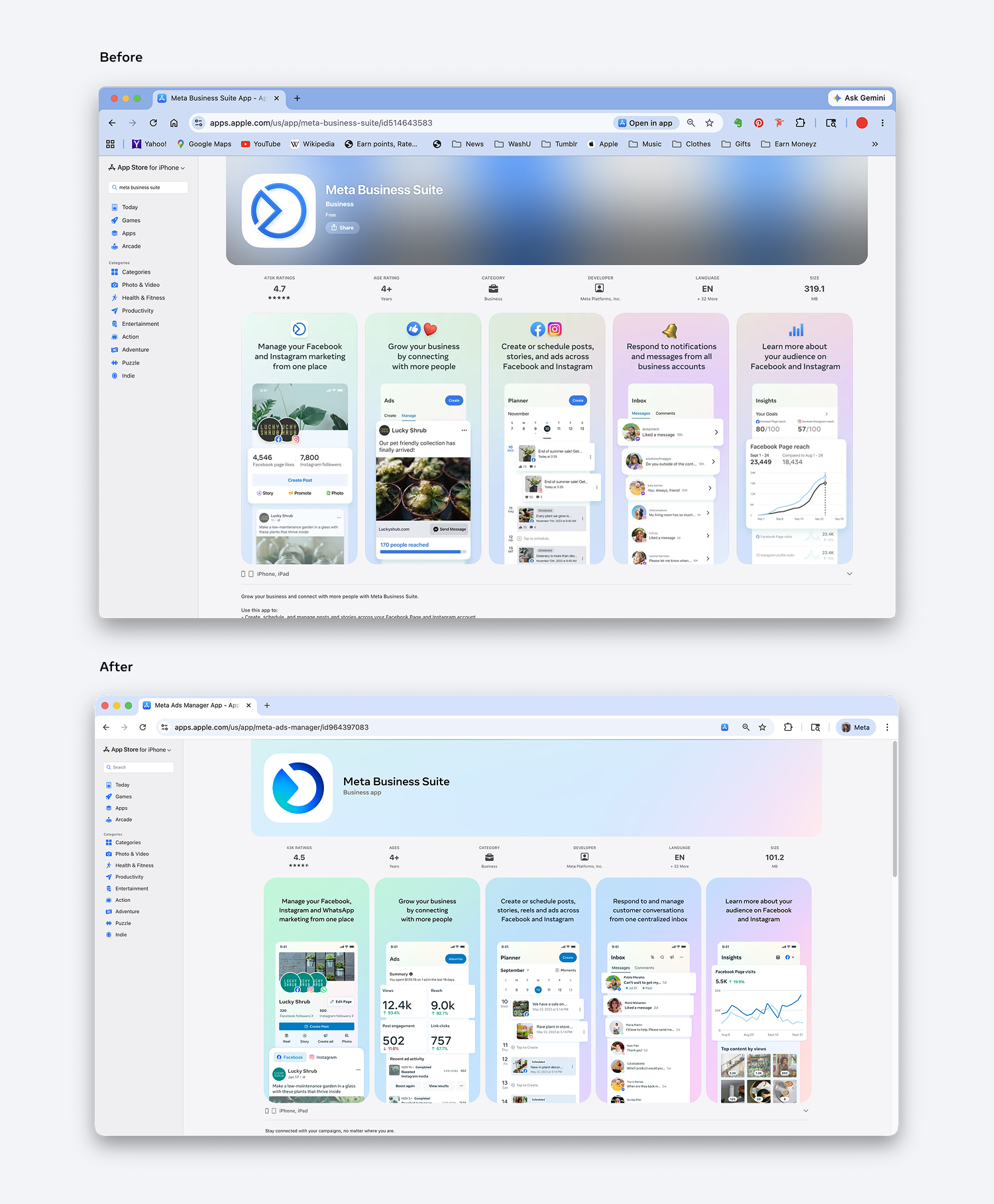
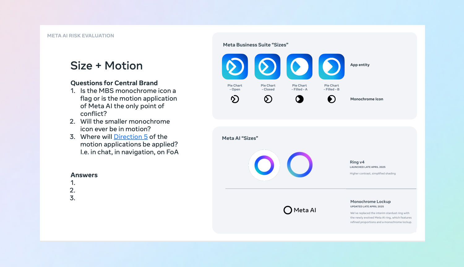
As the app icons neared final approval, concerns emerged that the Meta Business Suite icon was too similar to the Meta AI brand, which was a ring at the time. The Meta Business Suite team wanted to keep the existing shape, while Central Brand pushed for a new direction. I navigated these conflicting interests to eventually land on a compromise that everyone could support.
Managing stakeholders
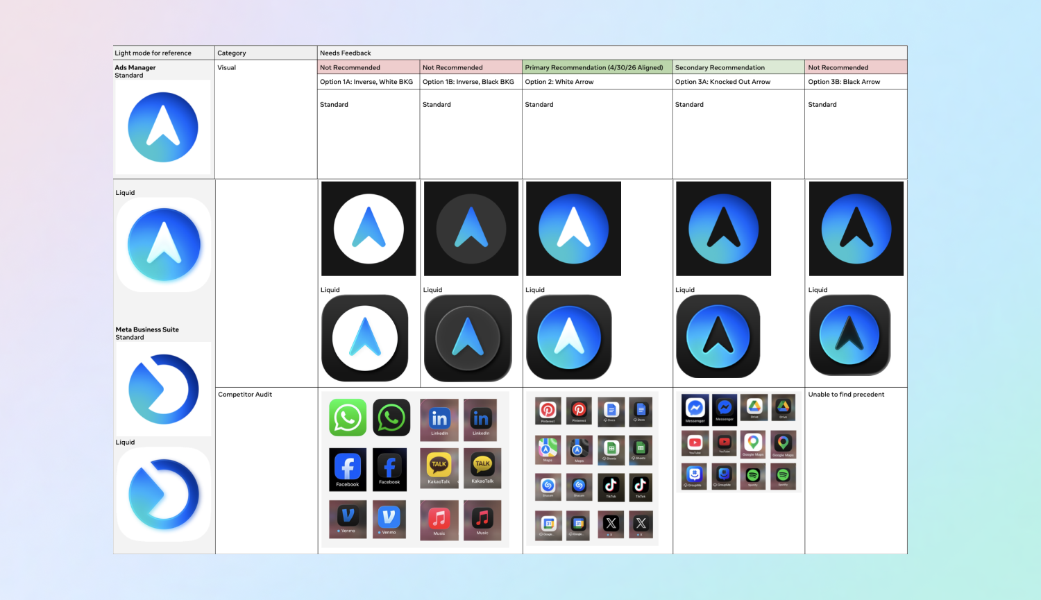
At the time, there were no Central Brand guidelines for the app icon dark mode visual application. I developed a proposal informed by a competitor audit, aligned stakeholders on an approach, and it was adopted as the official guidance for future Meta apps.
Influencing Central Brand Guidelines
Localization
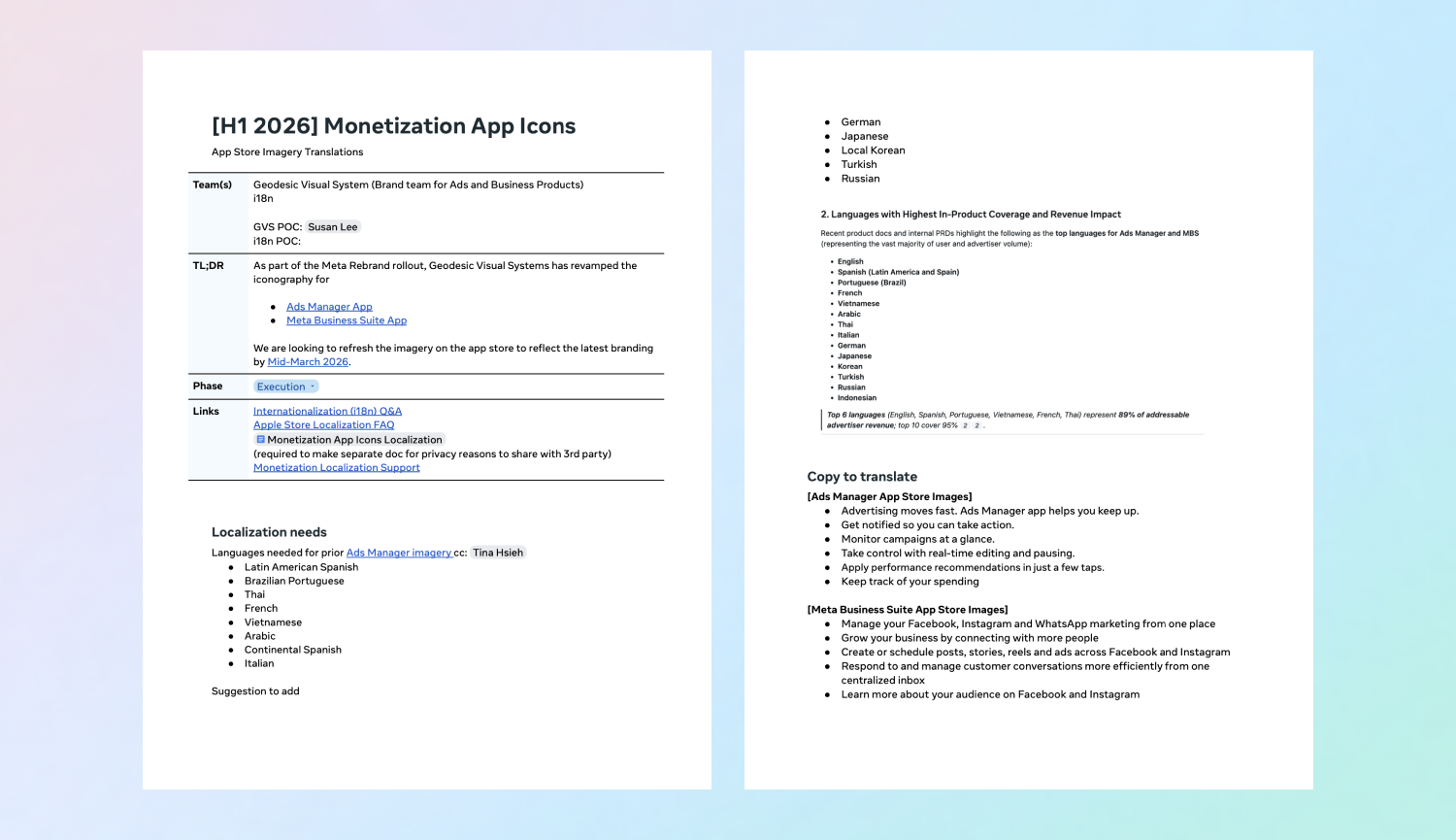
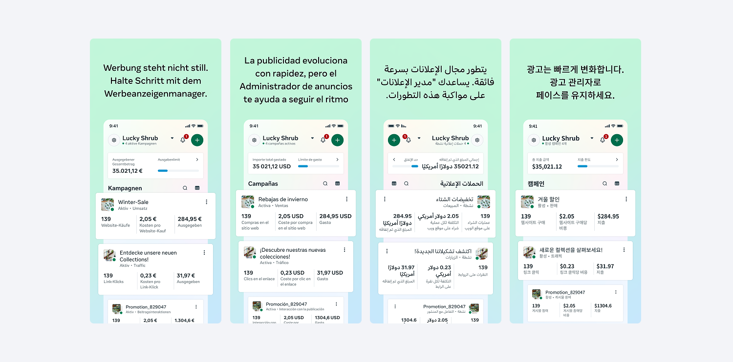
Because Meta serves a global audience, the app store imagery needed to be translated for each major audience. I created a brief for the localization team to translate the set of Meta Business Suite imagery and the set of the Ads Manager imagery and then vibe coded a plug-in to resize the images for the Android and iPhone placements.